
A good SaaS website has one job: turn the right visitor into a signup or a demo. Getting that right takes strategy before design, and a build that performs as well as it looks. At What IF Web, a Webflow Premium Partner based in Christchurch, New Zealand, we've built SaaS marketing sites from scratch and rebuilt ones that weren't working. Here's the full process.
What should you decide before designing a SaaS website?
The most expensive SaaS website mistakes happen before a single design is opened. Teams skip the thinking, go straight to visual references, and end up building something that looks right but doesn't perform.
Before anything else, three things need to be clear.
Who the site is for. Not "marketing teams at B2B companies." A specific person, with a specific problem, at a specific stage of the buying journey. User personas built around real pain points.
What the customer journey looks like. Map the path from first awareness through to purchase. Your site architecture should mirror that journey, not just list what the product does. Homepage, features pages, pricing, case studies, blog, help centre: each page has a job.
What success looks like. Define the primary conversion goals upfront: free trial signups, demo requests, purchases. Then set secondary metrics. Engagement benchmarks. Without these, you're building to a brief that has no way to be measured.
How should you write copy for a SaaS website?
Most SaaS websites spend more time describing the product than speaking to the person evaluating it.
Specific outcomes beat vague feature labels. "Reduce onboarding time by 40%" gives a buyer something to take back to their team. "Powerful onboarding tools" gives them nothing. Lead with what changes for the buyer after they sign up, in plain language.
A content hub earns trust over time. Comparison guides, use case articles, industry-specific content, documentation that's searchable. These aren't just SEO plays. They show the company knows what it's talking about.
CTAs matter more than most teams give them credit for:
- Place primary CTAs above the fold
- Use specific language ("Start your free trial" over something generic)
- Create micro-conversions for undecided visitors (newsletters, downloads)
- Make mobile CTAs thumb-friendly
What good SaaS design does in five seconds
SaaS website design has one job: if a visitor can't tell what the product does and whether it's for them within five seconds, the messaging isn't clear enough.
A few principles that apply across every page:
- Show the after state. What does life look like for the customer once they're using the product?
- Progressive disclosure. Start with the big idea, support it with evidence, then detail. Only when the user asks for it.
- Visual hierarchy. One dominant headline, supporting subheadline, single high-contrast CTA, minimal competing elements above the fold.
- Familiar logos and badges build trust. Customer logos, security badges, and testimonials carry more weight when they're placed near the decision the reader is about to make.
- Frictionless forms. Minimum fields, inline validation, social login where possible. Never ask for a credit card upfront unless it improves the signup rate.
Webflow or custom code: which is right for a SaaS site?
For most SaaS marketing sites, the platform choice comes down to two options: Webflow or custom code.
Webflow for marketing sites is what we build on for most SaaS clients. It gives marketing teams direct control over the site without touching a developer. Fast iteration, clean code, integrated CMS, native interactions and animations without heavy JavaScript. Global CDN and automatic SSL built in. If you need to move quickly and want design and build in the same hands, Webflow is usually the right call.
The Carepatron site is a good example of this in practice: a Webflow marketing site running alongside a custom React product, with the marketing team managing the site independently. It went from 10k to 450k monthly sessions after the rebuild.
Custom code with React and Astro is the right call when the site needs to behave more like a product than a marketing tool. Astro with React islands delivers static or server-rendered HTML by default, near-zero client-side JavaScript, and Core Web Vitals that most Next.js sites can't match. The tradeoff is more developer time and a higher bar for content updates.
Page speed and conversion
Page speed directly affects conversion rates. A one-second delay in load time can make a measurable difference. The exact number varies by industry, but the direction is always the same.
The essentials:
- Modern image formats (WebP) with lazy loading
- Minimal JavaScript through code splitting
- CDN for global asset delivery
- Regular monitoring with PageSpeed Insights and Lighthouse
What IF Web's position on this
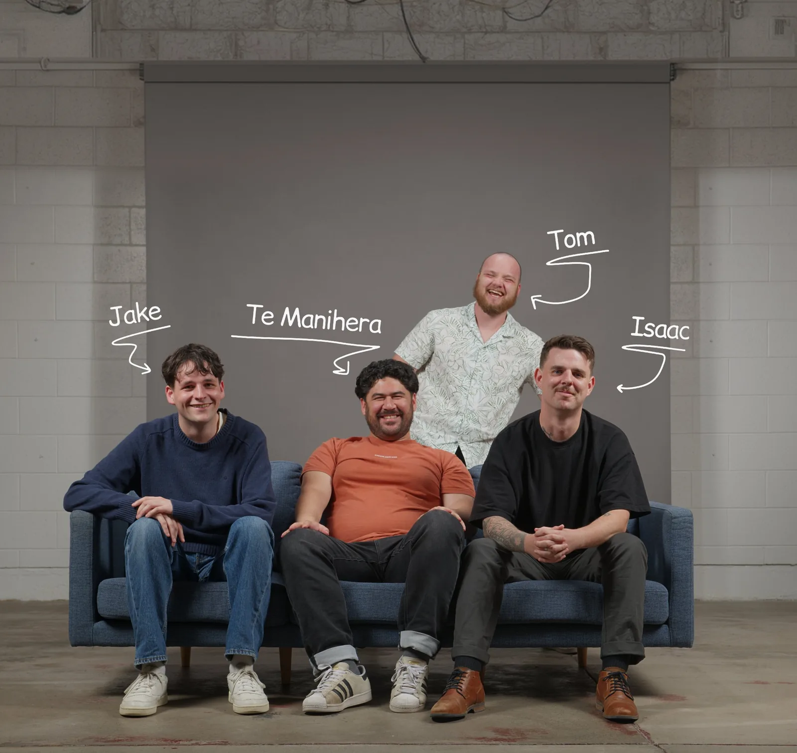
What IF Web is a Webflow Premium Partner based in Christchurch, New Zealand. We offer web development for New Zealand businesses across SaaS and B2B, locally and globally.
If you're building or rebuilding a SaaS site and want to talk through the approach, we're happy to have that conversation.