The Objective
NextMinute is a New Zealand-built project management platform for tradies, the people installing kitchens and building houses, used across New Zealand and Australia to manage jobs, send invoices, and keep track of who is on site.
NextMinute had recently been through a brand refresh. The new branding was modern and had real personality, but it had not yet made its way out into the world. Their website had not caught up: they had earlier moved off WordPress onto Webflow, a smart move for a growing SaaS company, but the old WordPress designs had been carried across in that migration. The physical side was a gap too, with no printed brochures, flags or convention gear to represent the new brand when they met customers in person. With no one handling design in-house, they needed a design partner to take the new brand and bring it to life properly, on the site and out in the world
What We Did
The brief came down to one thing: take NextMinute's new brand and make everything look and feel like the company behind it. That started with the website and grew into the brand's whole presence, printed and physical included.
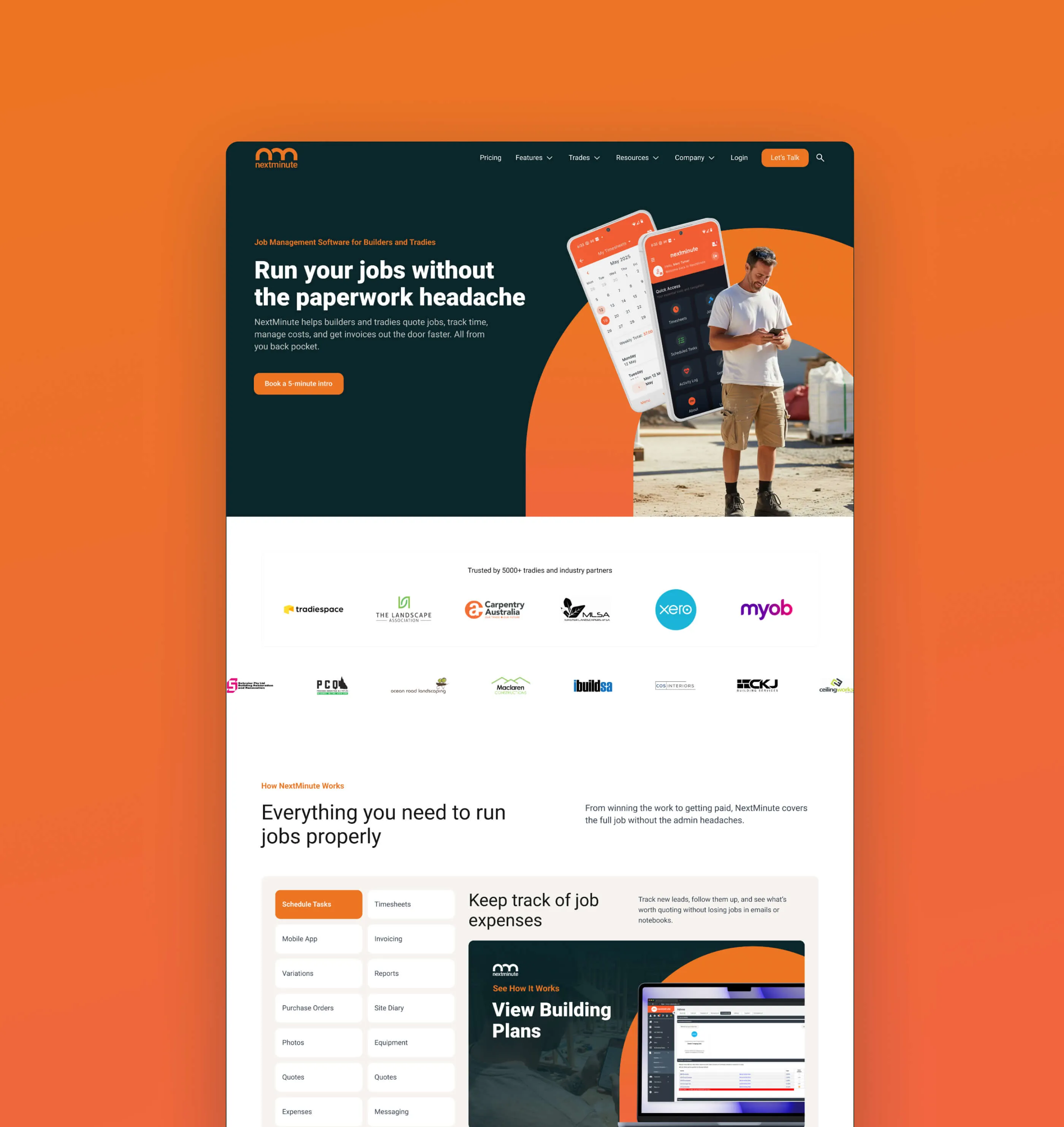
NextMinute's audience is hands-on Kiwi and Australian tradies, the kind of people you could have a beer with, and the site needed to read approachable and human, not the alienating vibe a lot of modern SaaS sites give off. Get that right and the right people feel at home and book a discovery call, which is what the site's onboarding is built around. You can't download the app and have a play to get a feel for it, so the site has to do the work of building enough trust for someone to reach out.
This was a design and branding project rather than a build. We worked directly with NextMinute's lead developer, who runs their website, sharing a Figma file and a Slack channel throughout, with designs built to hand over cleanly for him to develop in Webflow.
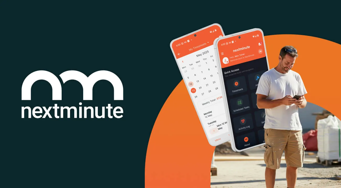
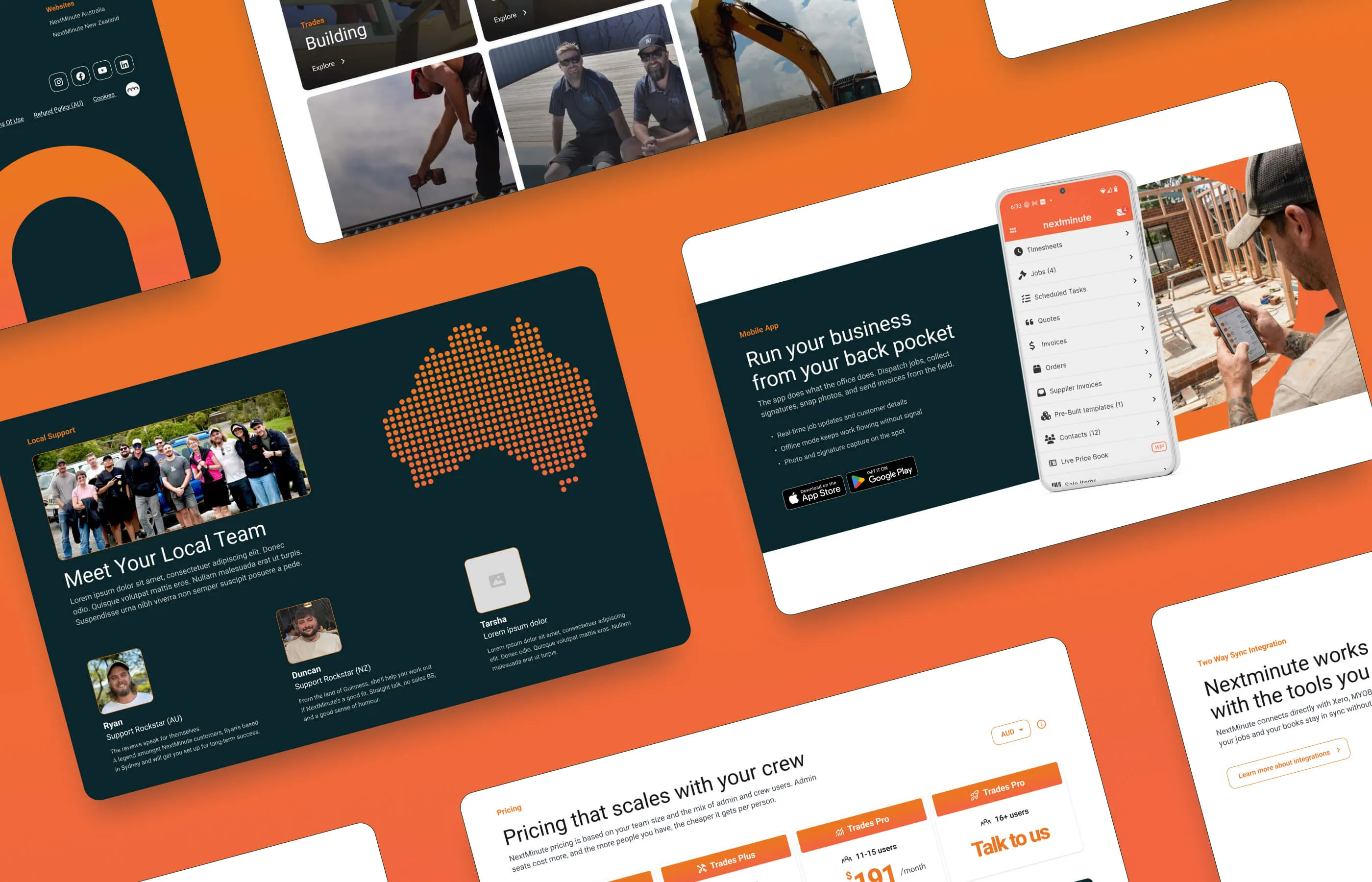
We set up the Figma file using Relume as the system backbone, with variables and components in place, and translated the new brand into a working design system. A short discovery phase pushed the branding further, finding the shapes, patterns and simple gradients, including the large orange arcs, that felt grounded and warm rather than slick. Building it as a system let us wireframe, restructure and apply copy quickly, make global changes without rebuilding layouts, and hand over something consistent rather than a set of one-off screens.
.webp)
The work included:
- Listening to what customers actually valued. A lot of their users care about the two-way Xero sync, so we surfaced it near the top of the page and built a simple diagram to explain how it works at a glance.
- Designing a high-fidelity homepage and mobile layout that brought the new brand to life, with a more human feel throughout.
- Replacing dated device assets, an old phone or laptop in a screenshot quietly ages a whole site, so the app was shown on current devices.
- Guiding visitors toward booking a meeting as the clear next step.
The handover itself was the part their developer valued most: a Figma design with a style guide, annotations and clean documentation, Loom walkthroughs talking through the design and the thinking behind it, and direction from me during the build as questions came up. Not a Figma file thrown over the fence, but a proper handover blueprint he could build from.
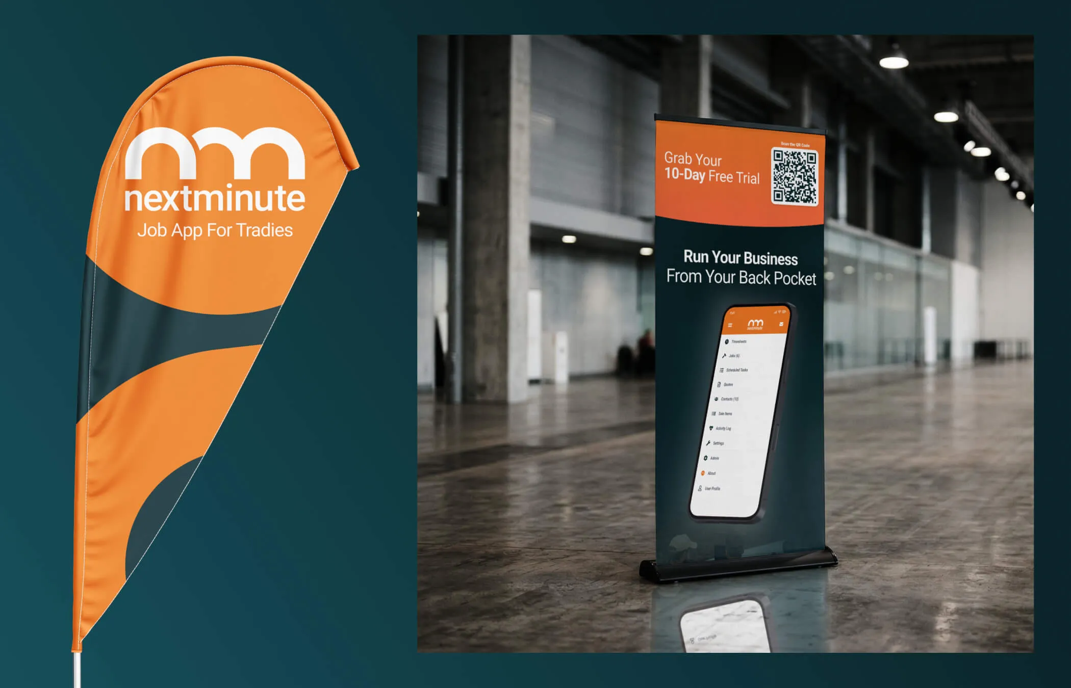
As the relationship grew, NextMinute brought us in for graphic and print design too. Their app screenshots were low resolution, with no large vector source to work from, so they could not be printed at size without going blurry. You cannot upscale an image after the fact, so we rebuilt the interface from scratch as clean vector artwork, using AI to design quickly and then refining it by hand with proper UI work. The result prints at any size and, in places, looks sharper than the live app.
That fed into:
- Convention assets: An updated brochure, a pull-up banner showing the vector phone with its key features called out, and a large backdrop carrying the app screen on desktop and mobile and a flag to wave people in.
- Apple App Store, Google Play and directory listing assets, plus a reusable vector phone UI asset.
- Social design, including Instagram posts built around their core messaging and LinkedIn and Facebook banners for both the company and individual employees.
.webp)

"Creative legends. We found What IF Web on Google while looking for web agency with real authentic creativity to bring our SaaS web project to live. Their website really stood out. We didn't want a boiler plate template, but someone who could take our brand guidelines and raise them to the next level. Tom was great to work with, communicated well, and understood what we were after first time. Highly recommended!"

The Result
NextMinute now has a homepage and design system that match the company behind them, modern and clean, while still reading as down to earth and unmistakably Kiwi and Australian. The site finally looks like the product it is selling, and it gives the right people a reason to reach out and book a call. The design was handed over ready for their developer to build in Webflow, with the documentation and direction to do it without guesswork.
What started as a homepage redesign has become an ongoing design partnership. NextMinute has continued to bring us in for print and graphic design on an hourly basis over the last few months as they grow their digital presence, from app store and directory assets to convention stands and social. The repeat work, across new disciplines, is the clearest sign the partnership is doing its job.